Brand Kit · Official assets
The official Voraal brand kit.
Approved logos, colours, type and platform assets — the single source of truth for partners, media, designers and our own teams.
01 — Brand overview
v | a — origin, gateway, arrival.
Voraal is Pakistan's parent travel-technology company and a master brand. Products may carry their own names, but they inherit this identity — so trust earned by one is earned by all.
Brand promise
Every journey, handled.
From the first search to the return flight home, Voraal is the system working quietly in the background — accurate, transparent, always on.
The mark
The monogram pairs the v and a of Voraal around a single vertical stroke — the Bar. It reads as a departure gate between origin and destination, and as a text cursor: travel and technology in one mark.
Personality
- Confidentnot loud
- Precisenot cold
- Warmnot casual
- Modernnot trendy
- Proudly Pakistaninot parochial
Downloadable resources
Download by package — or everything at once.
All files are production-ready: vector SVG masters, high-resolution transparent PNGs and platform-sized social assets. Free to use for referencing Voraal accurately.
Complete brand kit
voraal-brand-kit.zip
Logos, favicons, app icons, social media, colours and typography in one structured folder.
Logo package
Tile, horizontal and vertical lockups, symbol and monochrome versions — SVG and transparent PNG.
voraal-logos.zip · 927 KB
Favicon package
favicon.svg, favicon.ico (16/32/48), Apple touch, Android, maskable and web manifest.
voraal-favicon.zip · 46 KB
App icons
App Store 1024, Google Play 512, every iOS and Android density, adaptive-icon layers.
voraal-app-icons.zip · 52 KB
Social media package
Profile, cover and share images sized for every major platform.
voraal-social-media.zip · 596 KB
Colour palette
ASE (Adobe), GPL, CSS, SCSS, JSON and a printable swatch sheet.
voraal-colors.zip · 126 KB
Typography
Geist and Geist Mono (SIL OFL) plus the type scale and Urdu font links.
voraal-typography.zip · 453 KB
02 — Logo
One mark, four approved forms.
The Tile is the default signature for app icons, avatars, favicons and any square format. The horizontal lockup is primary for web and documents. Never redraw the mark — use these master files only.
Primary logo — the Tile
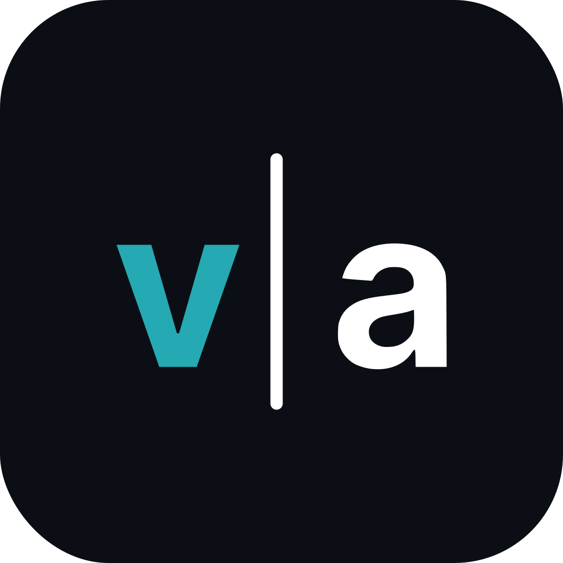
Primary logo — the Tile (full colour)

Transparent background
Tile on Ink grounds (1 px Ink 700 keyline)

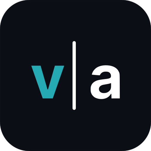
Transparent background
Horizontal lockup — primary for web & documents
Gap between Tile and wordmark = ¼ Tile width. Place it top-left, aligned to the margin; never centre it in body content.
Horizontal lockup — on light

Transparent background
Horizontal lockup — on dark
Transparent background
Secondary logos
The vertical lockup is for splash screens and covers, where it may be centred. The untiled symbol is for dark grounds only, when the Tile would double up on Ink.
Vertical lockup — on light
Transparent background
Vertical lockup — on dark
Transparent background
Symbol (untiled) — dark grounds only
Transparent background
Monochrome & single-colour
For single-colour print, fax, emboss, stamps, engraving, foil, dark merchandise and video bugs. Single-colour files knock the letters out of the Tile, so they print with one ink.
Monochrome reversed — Ink Tile, white letters
Transparent background
Single colour — Ink (letters knocked out)
Transparent background

Single colour — White (letters knocked out)



Transparent background
Monochrome — Ink symbol (fax, emboss, stamps, engraving)
Transparent background

Monochrome — White symbol (foil, dark merchandise, video bugs)


Transparent background
Horizontal lockup — single colour Ink
Transparent background

Horizontal lockup — single colour White


Transparent background
Vertical lockup — single colour Ink
Transparent background

Vertical lockup — single colour White


Transparent background
Logo spacing
Clear space and minimum size.
x = ¼ of the Tile width. Keep this zone free of text, edges and other graphics. For lockups, measure x from the Tile, on all four sides of the whole lockup.
x = ¼ Tile width
| Asset | Digital | |
|---|---|---|
| Tile | 20 px | 7 mm |
| Horizontal lockup | 96 px | 25 mm |
| Vertical lockup | 64 px | 18 mm |
| Favicon (simplified file) | 16 px | — |
| Embroidery & foil (single-colour symbol) | — | 12 mm |
64 px
32 px
20 px min
96 px lockup min| Web & apps | SVG (master), PNG @1x/2x/3x on transparent |
|---|---|
| Favicon | SVG + ICO 16/32/48, simplified Tile |
| App stores | 1024 × 1024 PNG, full-bleed Ink, no mask |
| Offset print | PDF/EPS vector, Pantone and CMYK versions — request from the brand team |
| Digital print & signage | PDF vector, CMYK; LED/backlit use the RGB file |
| Embroidery & foil | Single-colour symbol, minimum 12 mm |
Background & contrast
Choose the file by the ground.
Full colour on White is preferred. On Ink, use the on-dark files, which add a 1 px Ink 700 keyline to the Tile. Teal grounds are for campaigns only. On photography, place the Tile only, over a calm, low-detail region.
Full colour on White
Preferred.
On Ink
Add 1 px Ink 700 keyline to the Tile.
On Teal
Campaign use only.
Monochrome — reversed
Ink Tile, all-white letters. Single-colour print.
Monochrome — Ink symbol
Fax, emboss, stamps, engraving.
Monochrome — White symbol
Foil, dark merchandise, video bugs.
Contrast rules
- Teal 500 always carries Ink text — never white (2.9:1 fails).
- For teal text on White use Teal 700 (5.9:1). On Ink use Teal 300.
- Corporate surfaces lead with Ink; consumer products lead with White for clarity.
Placement
- Print & documents: top-left, aligned to the margin.
- Campaigns: bottom-left, signing off a headline-led layout.
- One logo per surface. Never centre the horizontal lockup in body content.
Approved & prohibited usage
Use the master files. Don't modify them.
- Use the SVG masters for web and apps; PNG @1x/2x/3x where SVG isn't supported.
- Keep clear space of x on all sides and respect minimum sizes.
- Products use a Tile with their initials in Teal 300 and a “by Voraal” endorsement, separated by the Bar.
- Don't set the logo letterforms from a font, or place the logo inside other shapes.
- Don't place the Tile on busy photography or flip it in RTL layouts — the logo never mirrors.
- Don't combine the Voraal logo with partner logos without written approval.
03 — Colour system
Ink sets the stage. Teal moves.
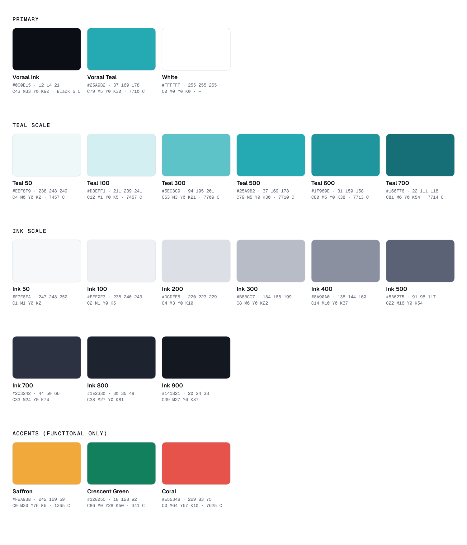
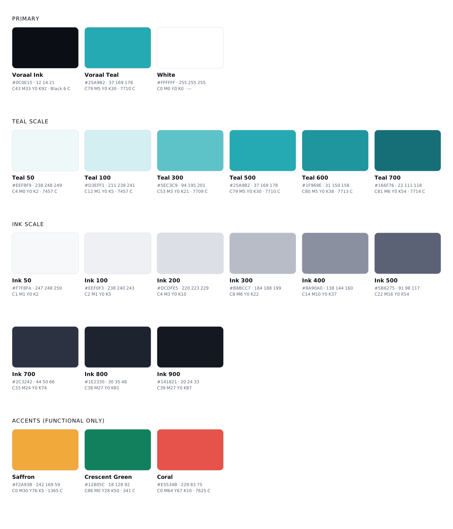
Sampled directly from the logo. Aim for roughly 60% Ink or White, 30% neutrals, 10% Teal. Accents are functional — they signal status and value, never decoration.
Primary · Foundation
Voraal Ink
- HEX
- RGB
- 12 14 21
- CMYK
- 43 33 0 92
- Pantone
- Black 6 C
Primary · Signal
Voraal Teal
- HEX
- RGB
- 37 169 178
- CMYK
- 79 5 0 30
- Pantone
- 7710 C
Primary · Space
White
- HEX
- RGB
- 255 255 255
- CMYK
- 0 0 0 0
- Pantone
- —
Teal scale
Teal 50
RGB 238 248 249
CMYK 4 0 0 2 · 7457 C
Teal 100
RGB 211 239 241
CMYK 12 1 0 5 · 7457 C
Teal 300
RGB 94 195 201
CMYK 53 3 0 21 · 7709 C
Teal 500
RGB 37 169 178
CMYK 79 5 0 30 · 7710 C
Teal 600
RGB 31 150 158
CMYK 80 5 0 38 · 7713 C
Teal 700
RGB 22 111 118
CMYK 81 6 0 54 · 7714 C
Neutrals — Ink scale
Ink 50
RGB 247 248 250
CMYK 1 1 0 2
Ink 100
RGB 238 240 243
CMYK 2 1 0 5
Ink 200
RGB 220 223 229
CMYK 4 3 0 10
Ink 300
RGB 184 188 199
CMYK 8 6 0 22
Ink 400
RGB 138 144 160
CMYK 14 10 0 37
Ink 500
RGB 91 98 117
CMYK 22 16 0 54
Ink 700
RGB 44 50 66
CMYK 33 24 0 74
Ink 800
RGB 30 35 48
CMYK 38 27 0 81
Ink 900
RGB 20 24 33
CMYK 39 27 0 87
Accents — functional only
Saffron
Value & attention — fare alerts, price drops, pending states.
RGB 242 169 59 · CMYK 0 30 76 5 · PMS 1365 C
Crescent Green
Success — confirmed, ticketed, refunded.
RGB 18 128 92 · CMYK 86 0 28 50 · PMS 341 C
Coral
Errors and critical alerts only. Text on white: #C2413A.
RGB 229 83 75 · CMYK 0 64 67 10 · PMS 7625 C
Pantone references are closest matches — always proof against a current physical swatch book. For large Ink areas in print, use rich black C60 M40 Y40 K100.
UI tokens — light & dark
| Token | Light | Dark |
|---|---|---|
| bg/base | #FFFFFF | #0C0E15 |
| bg/subtle | #F7F8FA | #141821 |
| bg/raised | #FFFFFF | #1E2330 |
| border/default | #DCDFE5 | #2C3242 |
| text/primary | #0C0E15 | #F7F8FA |
| text/secondary | #5B6275 | #8A90A0 |
| text/brand | #166F76 | #5EC3C9 |
| action/primary | #25A9B2 | #25A9B2 |
| action/hover | #4FBDC4 | #5EC3C9 |
| action/active | #1F969E | #1F969E |
| focus/ring | #166F76 | #5EC3C9 |
Palette files
Import the palette straight into your tools.
04 — Typography
Engineered type, in two scripts.
Four open-licence families (SIL OFL, free on Google Fonts) cover English, Urdu and data. The logo letterforms are master artwork — never set them from a font.
Secondary · Data
Geist Mono
Codes, PNRs, times, labels, eyebrows. 400 · 500 · 600
Google Fonts specimen ↗Urdu · Interface
Noto Naskh Arabic
Urdu UI, forms, tickets, small sizes. 400 · 500 · 600
Google Fonts specimen ↗| DisplayGeist 600 · 72/76 · −3.5% | Pakistan, connected. |
|---|---|
| H1Geist 600 · 56/60 · −3% | Book with certainty |
| H2Geist 600 · 40/46 · −2.5% | Flights to 140+ destinations |
| H3Geist 600 · 28/34 · −1.5% | Your trip to Skardu |
| H4Geist 600 · 20/28 · −1% | Baggage & fare rules |
| Body LGeist 400 · 18/28 | Clear, warm and specific about what the traveller gets. |
| BodyGeist 400 · 16/24 | Free cancellation until 24 hours before departure. |
| UI labelGeist 500 · 14/20 | Departure date · Passengers · Cabin class |
| Eyebrow / dataGeist Mono 500 · 12/16 · +8% | PNR 7XK2QF · GATE B14 · SEAT 23A |
Numbers & pricing
PKR148,500
Return · 1 adult · all taxes & fees included
- Geist 600 with tabular figures for every price, total and table column.
- Currency code before the amount at ⅓ size, Ink 500. Thousands separators; never decimals for PKR.
- Strike-through only for real, verifiable discounts.
Bilingual pairing
Every journey, handled.
ہر سفر، ہماری ذمہ داری۔
- Set Urdu ~20% smaller than Latin at the same level; Nastaliq line-height ≥ 1.9, Naskh ≥ 1.6.
- Mirror the whole layout in RTL — the logo is the only element that never flips.
- No letter-spacing or uppercase transforms on Urdu.
05 — Iconography & visual elements
Real places. Quiet precision.
Photography carries emotion; the interface carries precision. Graphic devices come only from the logo.
The Bar
Primary device. Divides origin | destination, EN | اردو, product | Voraal. Always vertical, always rounded.
The Tile
Squircle at 19.3% radius — containers for app icons, product badges and feature cards.
Gate pattern
Repeated Bars at a 26-unit rhythm, tone-on-tone only. Backgrounds, packaging, event walls.
Signal gradient
The only gradient: a soft Teal glow (≤35% opacity) on Ink. Hero areas only. Never on text or buttons.
Iconography — 24 grid · 1.75 stroke · round caps
Outline icons in Ink; Teal only for the single active or selected state. Filled icons are reserved for tab-bar active states. Base set: Lucide (ISC), extended in the same geometry.
Photography & illustration
- Natural colour, slight cool grade, deep Ink-like shadows, generous negative space for type, authentic local detail — Pakistan first.
- Illustration is diagrammatic: lines, nodes and the Bar describe routes, flows and systems.
- No heavy filters, teal washes, “suitcase on beach” clichés, glowing data-globes, AI-generated people, mascots or 3D clay renders.
Website & application branding
Favicon and app icons.
Favicons use the simplified Tile file — letters enlarged and the Bar thickened so the mark survives at 16 px. App icons are exported as full-bleed Ink squares; the platform applies its own mask, and the Tile radius matches iOS so the mark never shifts.

16 px

32 px

48 px
60 px
96 px
HTML <head> snippet
<link rel="icon" href="/favicon.ico" sizes="48x48">
<link rel="icon" href="/favicon.svg" type="image/svg+xml">
<link rel="apple-touch-icon" href="/apple-touch-icon.png">
<link rel="mask-icon" href="/safari-pinned-tab.svg" color="#0C0E15">
<link rel="manifest" href="/site.webmanifest">
<meta name="theme-color" content="#0C0E15">
Questions
Brand kit FAQ
Need print separations, a co-branding approval or a format that isn't here?
[email protected]Where can I download the Voraal logo?
On this page. Every approved Voraal logo is available as an SVG master and as transparent PNG files, individually or in one ZIP (2.2 MB).
What are Voraal's brand colours?
Voraal Ink #0C0E15 (RGB 12 14 21, CMYK 43 33 0 92, Pantone Black 6 C), Voraal Teal #25A9B2 (RGB 37 169 178, CMYK 79 5 0 30, Pantone 7710 C) and White. Aim for roughly 60% Ink or White, 30% neutrals and 10% Teal.
Which fonts does Voraal use?
Geist for headlines, interface and body text; Geist Mono for codes, times and labels; Noto Nastaliq Urdu for Urdu display; and Noto Naskh Arabic for Urdu interface text. All four are free under the SIL Open Font Licence.
How much clear space does the Voraal logo need?
Keep a clear zone of x on all four sides, where x is one quarter of the Tile width. Minimum sizes: Tile 20 px (7 mm), horizontal lockup 96 px (25 mm), vertical lockup 64 px (18 mm).
Can I change the colours of the Voraal logo?
No. Use only the approved versions: full colour, on-dark, reversed, and single-colour Ink or White. Never recolour, stretch, rotate, retype or add effects to the logo.
Who do I contact for other formats or approvals?
Email [email protected] for print-ready PDF/EPS files with Pantone and CMYK separations, co-branding approvals or anything not covered here.
Social media branding
Sized for every platform.
Profile images are full-bleed Ink squares at Tile proportions — each platform applies its own circle or rounded mask, so the mark stays centred and never clips. Covers keep the logo and message inside each platform's safe area.
Facebook
Profile 720×720
Displays as a circle (≈196 px desktop).
PNG · 12 KBCover / banner 1640×624
Content kept inside the centre 1110 px so the mobile crop and profile overlap never clip it.
JPG · 77 KBLinkedIn
Profile 400×400
Company page logo (square).
PNG · 6 KBCover / banner 1128×191
Company page banner. Left 300 px kept clear for the overlapping logo.
JPG · 19 KBInstagram
Profile 1080×1080
Upload 1080 px; displays at 320 px in a circle.
PNG · 19 KBX (Twitter)
Profile 400×400
Displays as a circle.
PNG · 6 KBCover / banner 1500×500
Bottom-left kept clear for the avatar; top and bottom 60 px may crop.
JPG · 57 KBYouTube
Profile 800×800
Channel icon; displays as a circle.
PNG · 13 KBCover / banner 2560×1440
Logo and tagline sit inside the 1546 × 423 safe area visible on every device.
JPG · 148 KBWhatsApp Business
Profile 640×640
WhatsApp Business profile photo (circle crop).
PNG · 10 KBTelegram
Profile 640×640
Telegram profile/channel photo (circle crop).
PNG · 10 KBTikTok
Profile 1080×1080
TikTok profile photo (circle crop, min 200 px).
PNG · 19 KBGoogle Business Profile
Profile 720×720
Google Business Profile logo (min 250 px).
PNG · 12 KBCover / banner 1024×576
Google Business Profile cover photo (16:9).
JPG · 65 KBOpen Graph / link sharing
Share image 1200×630
Default Open Graph / X summary_large_image / LinkedIn share image.
PNG · 101 KBShare image 1200×630
Share image for the Brand Kit page.
PNG · 91 KBEmail signature
Signature logo 300 px wide
Horizontal lockup for HTML email signatures (display at 150 px wide).
PNG · 7 KB